Spring Renewal: The Hottest Home Colors Spring 2026
Spring 2026 brings with it a deep desire for balance, tranquility, and a grounded optimism. In the world of interior design, color trends reflect our need to create sanctuaries that protect us from the fast pace of everyday life, while harmoniously connecting us with nature and technology. This year, palettes are shifting away from cold, sterile grays and moving toward warm, earthy tones, refreshing pastels, and colors that exude vitality.
Let’s explore in detail the colors that will dominate interior spaces in the spring of 2026 and how you can incorporate them into your own home.
1. The Return of Earth: Warm Terracotta and Brick Red
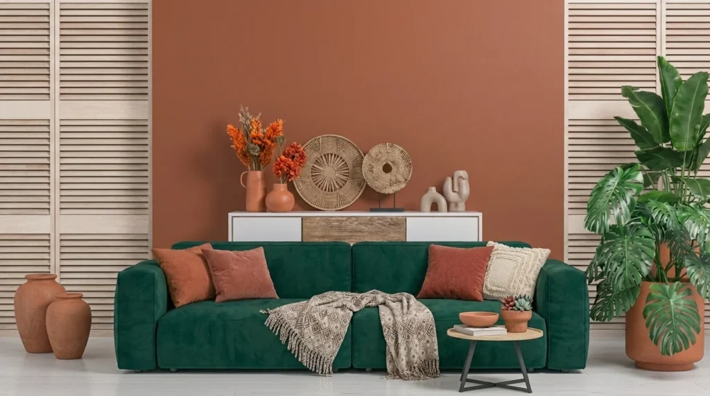
In 2026, the need to connect with the natural environment is stronger than ever. Terracotta, in all its expressions (from soft rosy and peach to deep brick red), is perhaps the most dominant color of the season.
- Why it stands out: It exudes warmth, coziness, and brings to mind natural materials like clay and soil. It is perfect for creating a “nest-like” feeling.
- Where to use it: It fits amazingly well in living rooms and dining areas. An accent wall painted in deep terracotta can transform a bland space into the ultimate relaxation center. It pairs perfectly with raw wood furniture, rattan, and large indoor plants.
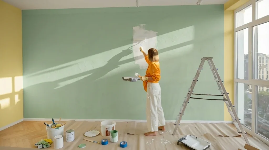
2. The Calm of Nature: Sage Green and Olive Green
Green continues its dominance in the decade’s trends, but for spring 2026, it takes on softer, muted shades. Sage green and soft olive green offer a fresh yet incredibly restful aesthetic.
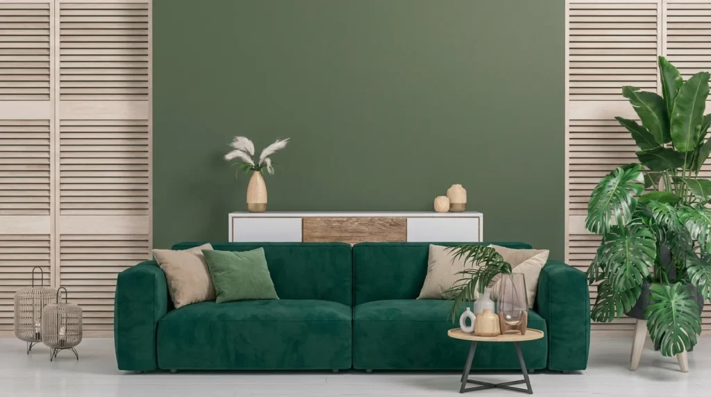
- Why it stands out: It functions almost as a new neutral color. It rests the eye, reduces visual stress, and brings the serenity of the outdoors inside.
- Where to use it: It is the absolute color for bedrooms, creating ideal conditions for sleep, as well as for bathrooms that want to evoke a spa feel. Try it also on kitchen cabinets for a rustic yet elegant touch. It pairs beautifully with brass (bronze) details.
3. The New Luxury: Butter Yellow
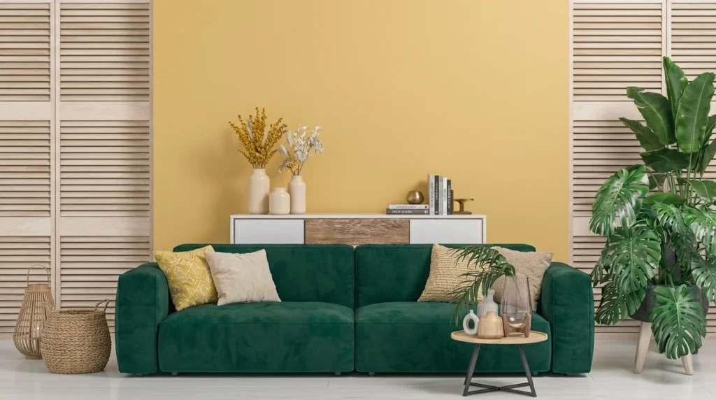
Leave behind the intense, “canary” yellows that can tire the eyes. This spring welcomes butter yellow, a shade so soft and creamy that it resembles the first light of dawn or French vanilla.
- Why it stands out: It brings a subtle brightness without the intensity of classic warm colors. It is cheerful, exceptionally welcoming, and discreetly boosts the mood.
- Where to use it: It is an excellent choice for dark rooms, windowless hallways, and corridors. It goes incredibly well with white marble, linen fabrics, and light-colored woods (like oak or birch), lending a sense of effortless luxury (quiet luxury).
4. The Surprise of the Season: Muted Plum
Although spring is traditionally associated with light pastel colors, 2026 twists the plot with the addition of soft plum / dusty purple to its core palettes.
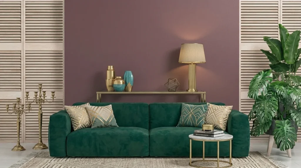
- Why it stands out: It offers unexpected depth, romance, and a dose of mystery. This year, it replaces dark grays, navy blue, or black as the ideal color to create strong color contrasts within a room.
- Where to use it: Use it in rich fabrics (like heavy velvet curtains, a striking headboard, or a statement sofa) or in a small space, such as a guest half-bath, to create an atmosphere of elegance and theatricality.
How to Combine the Trends: Application Guide
To achieve a professional and flawless result, the secret lies in the right combinations and the management of textures.
- The 60-30-10 Rule: This is the golden rule of decorating. Use a warm neutral (like butter yellow or an off-white) for 60% of the space (walls, ceiling). Choose sage green or terracotta for 30% (furniture, large rugs, curtains) and leave the plum for the remaining 10% (small decorations, vases, artwork, pillows).
- The Importance of Textures: Because the colors of 2026 are “quieter” and earthy, give visual interest to the space through materials. Mix matte wall paints with glossy, handmade ceramics, chunky wool knits, bouclé fabrics on sofas, and natural, unvarnished wood.
- Monochromatic Harmony (Tone-on-Tone): If you prefer minimalism, choose a single color from the above (e.g., terracotta) and use different shades of it (from very light rosy to dark brick) in the exact same space. This technique creates a sense of visual continuity and gives the illusion of a larger space.
The Role of Lighting
We must not forget that color perception depends entirely on light. The home colors spring 2026 have the amazing ability to transform throughout the day:
- Natural light: Let the sun’s rays highlight the purity and natural freshness of the green.
- Artificial lighting: In the evening, choose warm light bulbs (2700K – 3000K) to emphasize the warmth exuded by terracotta and butter yellow. Avoid cold, white lighting (above 4000K), as it will “freeze” the space and make earthy tones look dull and flat.
Summing Up
Spring 2026 invites us to turn our homes into personal retreats, away from the noise of the outside world. By choosing shades that draw their main inspiration from the earth, sunlight, and water, we can compose spaces that not only look aesthetically perfect and modern, but also exude a deep sense of well-being. Dare to refresh your space and bring fresh color into your life!